By Jaco Grobbelaar on Thu, Mar 02, 2017 @ 08:47 AM
The most critical components of an effective website is not SEO or calls-to-action. The most important thing for your site is the user’s experience.

“Pretty websites… are rarely websites that convert as well as un-pretty ones.” - Seth Godin
The truth may seem harsh, but your pretty website may never be seen long enough to be appreciated if your visitors are not quickly engaged. And one of the quickest ways to end any engagement is with poor usability.
There are what could be considered “cardinal rules” for website design that places the user as the focus. One writer put it this way:
“Don’t make it hard for me to know what you do. Don’t make it hard for me to find my way around. Don’t make it hard for me to contact you. And don’t make it hard for me to give you my money!”
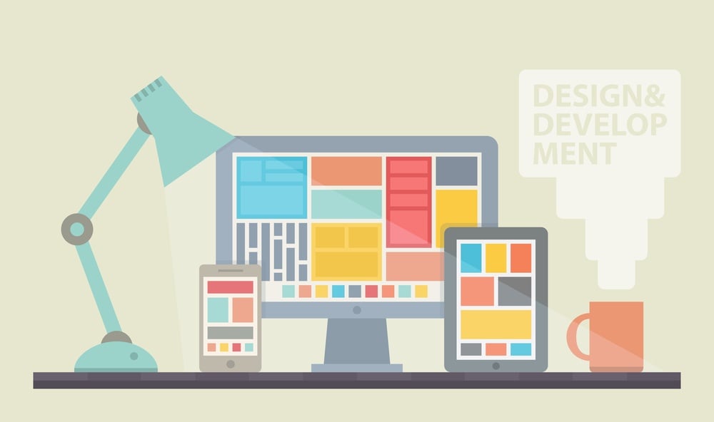
Design Matters
Your website design is critical.
However, website design that focuses on impressing other designers - vanity sites with the latest trending widgets, bells, and whistles - is design that is flawed. While the site may be dazzling to the eye, if it fails to convert a visitor due to poor navigation or confusing content and layout, then it fails. Period.
This is not to say that your site needs to look like an industrial e-commerce site from 2005. But there must be a strategic and well-planned approach to finding a good balance of visual elements, layout, and functionality.
As a first-time visitor to your website, a user must be able to quickly recognize what and who you are, where they can go to answer questions, and how to get a hold of you should they want to talk.
Ogling your retina-blasting images or searching through excessive “white space” to find a miniature block of text is not interacting. It’s distracting. And distracted visitors are quickly absent visitors. People must be easily engaged and led to interact with your website in order to be seen as a “conversion”
The problem for many business owners is that they already have a website. It was already designed and launched. And often it is already getting… well - dated. Rapidly changing technology can make this happen in just a few years, unfortunately. While a redesign may often be the ideal solution, it takes time or money for such a large project.
So what is a business owner to do in the interim?
Seven Tips for Better User Experience
Fortunately, there are some things that can often be done to an existing website that can drastically improve the experience of users on the site.
Here’s a short list of some of the best things you can do or add to your website to make it easier to use:
Don't Simply Go Stock With Images
Almost anyone on the Internet today knows a stock photo when they see it. No matter how nice it looks, it actually devalues your website. There is a mental association with "impersonal" or "inauthenticity" that comes from stock images.
Using real images of you, your staff, your products, buidling - whatever - can be far more effective and improve your overall user experience. These are much better than using the same stock photo of generic person smiling at the camera from behind a desk, just like your competetion does.
And size matters, as well. According to an article from Justin Zalewski,
“Speed matters. Every fraction of a second a visitor waits for your site to load, their frustration grows—and that frustration is aimed at your brand. Images account for a significant portion of that load time.”
Make sure you’re not making your visitors download a gigantic image that’s only being used as a tiny thumbnail. Avoid using stock photos. Cheesy stock photography is the quickest way to turn a great site into a mediocre one.
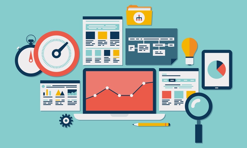
Make it Fast
As Justing Zalewskit points out, "Speed matters." The sad fact is that slow page load is an unwanted experience for your users. And because it can be a source of frustration, too often users simply don't wait. In fact, even A 2-second delay in load time during a visit results in abandonment rates of up to 87%.
There are great, free tools for finding out how fast your site is - or not. For example, Google offers a free service that will provide information on your page speed. In addition, they will offer you some suggestions for improving your load time both on mobile devices as well as for desktops.
Make it Personal and Real
There is nothing wrong with your website being different and unique. Too many business owners - and a fair number of web designers - fall into the "Us, too!" trap. This is the design approach that looks to the web for the typical styles, layouts and features that everyone else in their niche seems to be using.
The problem is that it is a self-perpetuating dynamic and results in a mass of vanilla, cookie-cutter websites that are indistinguishable from each other. But yours doesn't have to be that way. Companies like MailChimp and others have mastered the art of standing out without over-complicating their website designs.
People should be able to get a strong sense of you, your company, and your culture through the graphics and words on your website. So, get personal and be real!
Keep It Simple and Clean
One of the best (and easiest) ways to a truly "user friendly" website is with a clean and simple layout. Design your site in such a way that it flows logically, is easy to navigate, and is not cluttered with excessive ads or junk content. Think like a user, not a "creative" because your site will be seen and - hopefully - used by regular people.
According to Design Shack,
“Simplicity and minimalism are the “it” design trends for a reason. Users understand them. The visual simplicity makes the interfaces easy to interact with. A design does not have to be overly complicated to work great and make users happy.”
Simple does not need to be boring, and complex is not always user-friendly.
You Should Have Great Calls to Action
Your customers are already accustomed to following visual cues to determine which content is important to them. Calls to actions that are clearly marked with an action word enable your user to more easily navigate your site and get to where they want. In creating buttons for your website you should think about color and the psychology of color.
Different colors evoke different messages. Think about the message that you want to evoke for a user (trust, experience, intelligence) and choose your colors wisely.The words should include a verb or an action word that excite the user to do SOMETHING.
Headings Should be Well Designed and Well Written
In a post for HubSpot, Darling Jiminez, pointed out that,
“Your headings and content should be driven by what your potential customers are looking for. Including keywords in your title is also very important for targeting your message and attracting the right audience.”
Search engines such as Google will typically give more weight to headings before the other content. This means that crafting well-worded headings can significantly improve your search results. But for users, your headings should be a clear guide through the site that helps them go where they need to and find what they are looking for.
One more thought about heading design: according to a post at Crazy Egg, using some white space around text and titles on your site can increase user attention by 20%.
Responsive Design is Not Optional
Technologies has evolved and changed so that we are an increasingly mobile society. Because of this, it's absolutely essential that your website is mobile-friendly and easy-to-navigate. It must work well no matter what type of device it is being seen on.
Not so sure about that? Well, Google has recently begun to penalize sites that are not mobile optimized. For local SEO, this means responsive design is even more crucial. According the experts, responsiveness is the single most valuable way in which you can improve your website’s user experience. Here is a free tool you can use to see whether your website is mobile.
Marketing is About More Than SEO and Design
Having a solid marketing strategy and plan is a needed in order to get those visitors to your site in the first place. More and more people are looking to the Internet to quickly and easily shop, search and find businesses, products and services near them.
And the rising number of mobile devices have pushed this trend relentlessly and shows no signs of slowing.
But once the visitors find your site you must have what is needed to engage them and keep them coming back. A great home page and a unique and engaging About Us page are essential to making that happen. Having a site that is easily navigable, easy to comprehend, and easy to use is a must-have.
Another critical step is to implement a solid local SEO strategy, and staying committed to it. With the right elements in place and great content, you’ll start seeing results within months. And because search engines such as Google tend to favor locally optimized businesses, you’ll want to be ahead of the curve.
A Great Local SEO Strategy is Partnering With Local Experts
The approach of content marketing for local SEO is a great one for your business. But achieving your local marketing objectives with a content marketing strategy does take time.
The good news is that you don't have to figure out alone. In fact, one of the best investments you can make with your marketing budget is to partner with a solid firm like Petaluma-based BroadVision Marketing. We are your local partner for your local marketing needs.
Click on the link below to get your free eBook "10-Step Checklist: Website Redesign" or call BroadVision Marketing at 707-799-1238.

All About You - The Most Neglected Page On Your Website?
A Good Inbound Marketing Agency Can Offer Affordable SEO Service

No Comments Yet
Let us know what you think