Inbound Marketing Infographic: Web Design Colors - Website Visitors
By Dean Sander on Thu, Aug 25, 2022 @ 04:50 PM

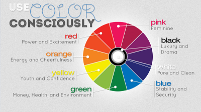
Colors compose a secret language that only the human subconscious – and savvy inbound marketers – can understand. There's a reason the walls of your local fast food restaurant are orange, red and yellow. These are colors that subconsciously excite you and stimulate your appetite. There is a science behind the calming shade of green of your favorite coffee shop’s cups and why there's so much red in casinos. The language of color is a huge advantage in the world of marketing.
To say that orange makes you hungry is an oversimplification. The orange countertops aren't going to bring in customers who are full and make them eat. But marketing surveys have shown that color is an element that directly affects consumer behavior. Color plays on associations in the mind that can elicit certain responses, which is why it’s one of the most powerful design elements on websites, ads, direct mail, and other marketing materials.
Colors do elicit responses, but these responses vary slightly from person to person. However, according to marketing research, there are some common associations made with certain colors. We have presented an infographic (naturally) with our logo on it to go along with an article by guest blogger Jason Lagden of Sydney, Australia.--Jaco

Web Design Colors Convince Website Visitors To Subscribe
They say content is king. If so, then form is queen. That is to say, while information serves the function of appealing to the intellect and rational part of a customer, the way the information is presented, the design, the images and colours used contribute greatly towards influencing the emotional aspect in the decision-making process.
Therefore it is important that a website designer pays attention to the colours used. Colours may not directly contribute to the effectiveness of a website but their influence cannot be ignored. So be it a newsletter that you want visitors to subscribe to or a product or service that you are selling online, use colours prudently and you will produce positive responses.
Happy visitors make decisions.
Colours can influence how you feel. The content or the relevance of the information on your website can be enhanced by the way it is presented. For example a good contrast between the colours of the background and the font used can play a great role in making visitors read the content. Similarly, attractive and bright colours indicate a brand personality that is confident. People who make buying decisions are also confident and know what they want. They prefer to buy from a company that comes across as happy and therefore has the potential to contribute to their happiness.
People buy happiness not products.
When a customer buys something, it is the sense of gratification or fulfilment which accompanies the purchase that remains as a reminder influencing their ability to make another purchase or recommend the product or service to another customer. Colours can be effectively used as emotional memory triggers. People don't remember facts or shapes as much as they remember colours. That's why some of the most popular brands are associated with one prominent colour that is exhibited in their logo, packaging and website.
When you think of yellow, what comes to mind? When you think of red, which brand comes to mind? When you think of blue, do you think of the sea? The power of colours to evoke images and influence emotions is unlimited. Great brands know this and exploit it in their websites.
When it comes to colors, less is more.
Don't go overboard and use too many colours. As mentioned before, most successful brands own a colour and to do so, they consistently use the colour as a dominant motif in all their communication. As a general rule, a brand should have a colour palette which consists of one dominant colour followed by a secondary colour and one or two associated colours. More than that and the brand landscape will turn out to be very confusing for the customer to remember.
So identify your dominant colours and let these lead the navigation cues on your website such as headlines, mastheads and the CTA or call-to-action buttons. Then watch the numbers of subscribers, online enquiries or purchases rise.
Why Choose Broadvision Marketing as Your Inbound Marketing Partner
As a leading inbound marketing agency, Broadvision Marketing is dedicated to helping businesses achieve their growth objectives through strategic inbound marketing initiatives. With our comprehensive expertise and proven track record, we have established ourselves as one of the best inbound marketing companies in the industry. Our team of experienced professionals is committed to delivering exceptional results and driving revenue for our clients.
Contact us today to learn more about how we can become your trusted inbound marketing partner and take your business to new heights.
You May Also Like
These Related Stories

Inbound Marketing Infographic: Web Design Colours - Website Visitors

WordPress Website Maintenance Checklist: 50+ Best Practices (Infographic)

.png?width=302&height=75&name=BVM%20Logo%20-%20transparent%20(1).png)


No Comments Yet
Let us know what you think