Landing Pages And Content Marketing Strategy
By Jaco Grobbelaar on Wed, Oct 17, 2018 @ 02:45 PM

The best content marketing strategies use landing pages to capture leads and build an email list. But there is far more to it than just having somewhere for them to land. You want to be sure that they stay and engage!
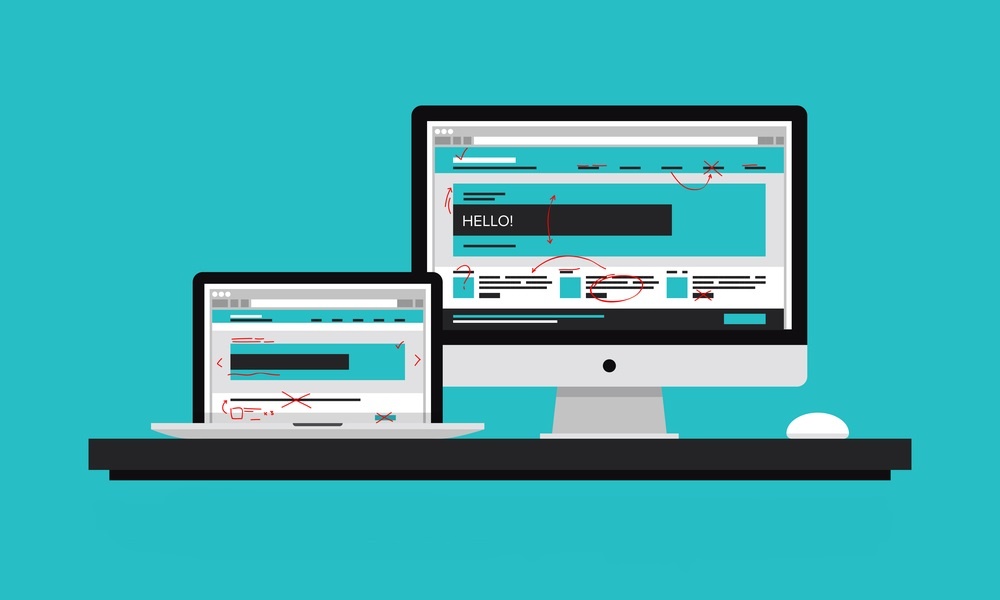
Have you ever been on a commercial flight that has a stop before you get to your final destination, but didn't require a plan change? It probably left you with that odd experience of being able to say you've "been" to a certain city, but you never really did anything there. You sat on a plane, looked out the window perhaps, and flew on to you final destination.
Unfortunately, that's a similar experience that many landing page visitors have. They click on an ad or an offer somewhere, are whisked away to a landing page, never do anything there and simply click away.
So, what was it about the landing page that kept them from acting on the offer?
Making Landing Pages an Engaging Destination
Thanks to the improved apps and technology available, creating landing pages has become much easier today than it used to be. But web tools do not guarantee optimal landing pages. Just because it's easy doesn't mean it's good.
The goal of a landing page is quite basic: compel a visitor to take an action.
This could be because of any number of reasons and it can be challenging to pin it down to any one or two things. But... if your landing pages are crafted with right elements in place and the optimum design structure, your click-through-rate will soar.
The question, then, is what constitutes a good landing page? Keeping in mind that the job of a landing page is to simply move a visitor take a specific action (or transaction!) on that page, this should preclude any other verbiage, imagery or unrelated content.
And, with that premise in mind, let's dive into some specific best practices for an optimum landing page.
Making Landing Pages Work Well
In keeping with our prelude to these tips, the first "best practice" is probably the most important:
1. Be Clear On Your Offer
It's okay to be patently obvious here since it is far better to seem a bit simplistic on your landing page than to risk confusing or distracting your visitor. Use the power of emotions to engage and compel an action on the part of your reader.
For example, you can leverage the idea of helping your reader to be a smart consumer by downloading your offer or subscribing. You could use a simple, but powerful, headline like:
"Be A Part Of An Elite Group Of Consumers With Our Exclusive Guide"
Everyone wants to feel smart and everyone likes to be part of an exclusive group. Craft your headline and call-to-action to highlight and leverage positive emotions and imagery. And keep it simple!
2. Important Content Stays On Top
If at all possible, don't make your reader have to scroll down to see all the critical information. Keeping this "above the fold", or in the top portion of the page, will ensure that nothing important is missed or overlooked. There is an cardinal rule in play here that states, "Don't make me think."
This does not imply that your readers are dull or incapable of navigating a page. But it does imply that people can be impatient and even fickle. If it takes some work or takes too long, they may well click away instead.
3. Be Bold, Clear and Simple With Call To Actions
The good ol' buttons we've become so accustomed to serve a vital purpose on your landing page. They will serve that purpose even better if they are easy to see, easy to understand, and are simple to use.
Actions can be anything from "Join Now", "Subscribe Today", and "Download Here" to "Try It For Free". The wording of your call to action buttons are determined by your offer, but it must be clear and simple. If you got them this far, you don't want to lose them because your call-to-action and your buttons were confusing or complicated.
4. Use Consistent Branding
While this should be obvious, the problem can arise when using proprietary landing page tools that offer a variety of design and style choices. But think like your audience: if you saw something on Facebook, for example, and clicked on it, you expect the branding on the page you are sent to will be similar to the ad you clicked.
This will include the fonts, the colors, any logos or company names, etc. Avoid fancy graphics, too many images and unrelated web elements. A landing page is not the place for links to your company blog, etc. Although contact information should be included consistent with what you have on your regular web pages.
5. Optimize For SEO
Just because you've linked your landing page to specific ads doesn't prevent visitors from finding it through organic search. In fact, a smart landing page will be optimized as much as possible for SEO purposes. This means including as many on-page SEO elements as you can.
For example, it may be possible to come up with certain industry-related keywords. You can use tools like Ubersuggest for identifying relevant keywords to incorporate into your landing page. This can be done by including them in your headlines, the text of the page, and any image alt text options in your graphics.
Optimizing Your Content Marketing Strategy
While this is not an exhaustive list, covering these fundamental best practices will ensure that your landing pages will be effective and engaging. And the more, the better when it comes to landing pages, by the way.
And, while you already know that implementing content marketing can boost traffic for your business, did you know that achieving your content marketing objectives takes time? Unfortunately, it won't happen with a few blog posts or some other great content.
People will need to consume your content for a while before they contact you. Yet, without your content compelling them to contact you, your goals may never be met.
The good news is that you don't have to figure out alone. In fact, one of the best investments you can make with your marketing budget is to partner with a solid firm like BroadVision marketing. Click this link to get your free Complimentary Inbound Marketing Session so you can make an informed decision, or call BroadVision Marketing at 707-799-1238.
You May Also Like
These Related Stories
Great Local SEO Needs A Great Local Landing Page
Effective Local SEO Requires Effective Landing Pages
.png?width=302&height=75&name=BVM%20Logo%20-%20transparent%20(1).png)


No Comments Yet
Let us know what you think