Good Content Marketing Needs Good Calls-To-Action
By Jaco Grobbelaar on Tue, Jun 25, 2024 @ 05:00 AM

[This article first appeared here in September 2017 and has been updated and revised for 2024.]
Content marketing can be a highly effective approach for your business. But your content needs an effective call-to-action to finish the job!
Most business owners are probably familiar with the term, but sometimes a little clarification is in order. So the question might be, "What is a call-to-action, of CTA, anyway?
The simple answer might look like this: A call-to-action, or CTA, is anything on a web page, an ad, or a piece of content that requests an action from the viewer or reader. Hubspot has a nice way of defining it, as well:
A call-to-action (usually abbreviated as CTA) is an image or line of text that prompts your visitors, leads, and customers to take action. It is, quite literally, a "call" to take an "action."
The action you want people to take could be anything: download an ebook, sign up for a webinar, get a coupon, attend an event, etc. A CTA can be placed anywhere in your marketing -- on your website, in an ebook, in an email, or even at the end of a blog post.
On a website, or online ad, it is often a virtual button or a link that is placed there which, if clicked, will take prospective customers to either a form to be filled out or a landing page. Once they have completed this action, the prospect then becomes a lead.
Here's an example of a CTA graphic we have used here at BroadVision Marketing:

When a visitor to our site (such as yourself) clicks on the real version of this CTA link, they are immediately taken to a landing page where we politely ask for an email address to send the free eBook to. This is an essential component for your content marketing strategy. Making your content work for you with calls-to-action.
Most importantly, the CTA serves as the link between the content that your website visitor was drawn to, a blog post perhaps, and a landing page or other essential destination on your website. The landing page will have a relevant and valuable offer for your visitor which will lead them to complete a short form, maybe something as simple as a first name and email address.
This is also one of the elements of an effective content marketing strategy, as well.
Why CTAs Matter
A call to action acts as your digital closer. It takes your audience from passive observers to engaged participants. Without a clear CTA, website visitors might be left unsure of what to do next, leading to missed opportunities. A strong CTA bridges the gap between your content and your goals, turning website visits into conversions and propelling your digital marketing efforts forward.
What Visitors Can Do With Your CTA
While your offer in the CTA can be any number of things that a visitor may want to access, there are a few typical offerings that can be used. The CTAs that can attract attention from potential leads include:
-
Download a free eBook
-
Make an appointment
-
Get a free consultation
- Subscribe to a newsletter
-
Start a free trial
-
Register for a free webinar
- And much more...!
Since many smaller businesses have limited resources when it comes to marketing and promotion it makes sense to maximize the opportunities available to get interested prospects take an action whenever possible.
This doesn't mean asking for a purchase or even to view some sales pitch, however. In fact, your initial CTAs should simply serve to provide a prospect with some form of valuable and relevant information - often more great content!
%20(1).jpg?width=1000&height=550&name=hero%20image%20RFC%20(1000%20x%20550%20px)%20(1).jpg)
Call-to-Action Best Practices
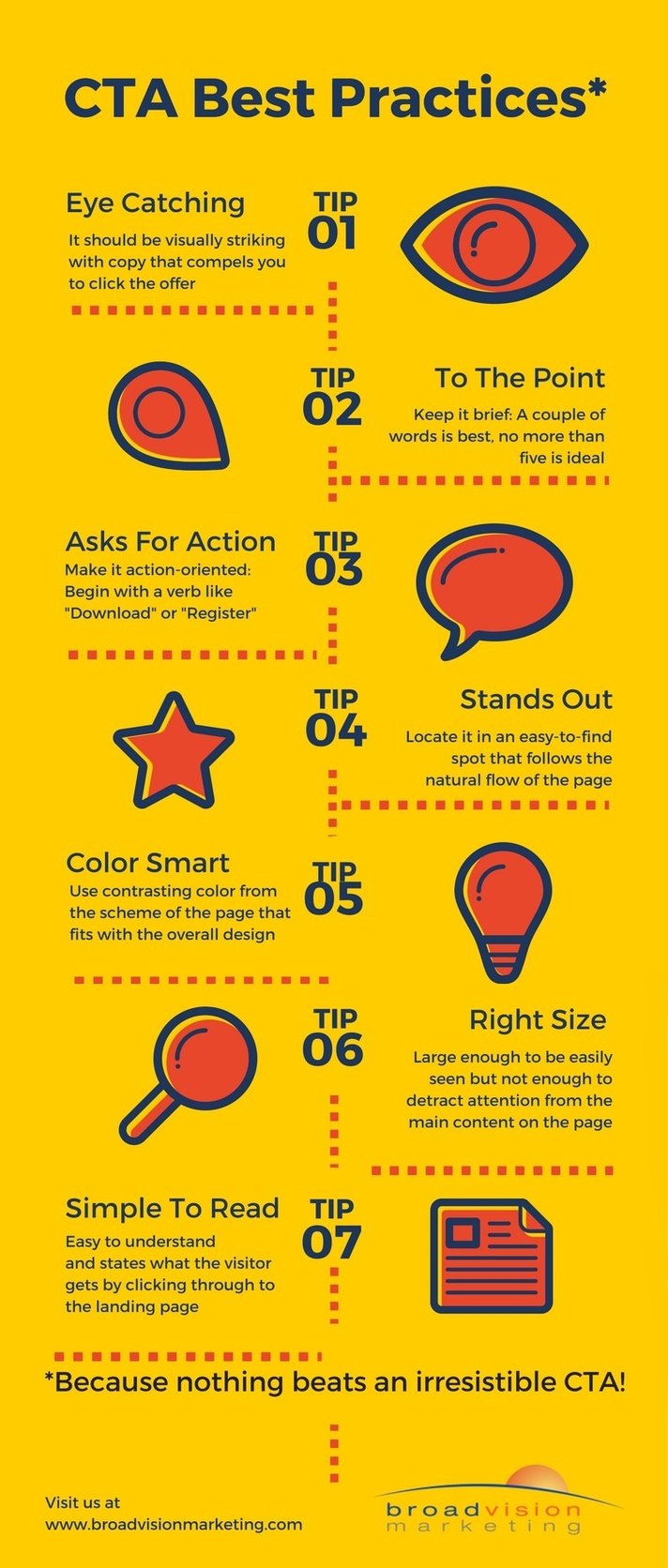
It has been recommended by our friends at Hubspot that CTAs follow suggested guidelines for optimal results. CTAs should be:
- Visually striking with copy that compels you to click the offer
- Brief: A couple of words is best, no more than five is ideal
- Action-oriented: Begin with a verb like "Download" or "Register"
- Located in an easy-to-find spot that follows organically from the flow of the web page
- In a contrasting color from the color scheme of the web page, while still fitting in with the overall design
- Large enough to see from a distance, but not so large as to detract attention from the main content on the page
- Easy to understand and clear: Be sure to state exactly what the visitor will get if they click on the CTA and go to the landing page
In addition, you may want to place your CTA button, or link, in a number of locations throughout your website where it does not interfere with the content. In the middle and at the end of each blog post are great spots, for example.
Craft Compelling CTAs: Boosting Engagement in Your Digital Marketing
In the ever-scrolling world of online content, grabbing your audience's attention isn't enough. You need a clear call to action (CTA) that compels them to take the next step. A well-crafted CTA can be the difference between a casual reader and a converted customer.
Here are some best practices to elevate your CTAs and turn website visitors into engaged users:
Clarity is King:
- Action Verbs: Don't be shy! Use strong verbs that leave no room for doubt about what you want your audience to do. Instead of "Click here," opt for "Download Now" or "Start Your Free Trial."
- Focus on Benefits: People are driven by what they can gain. Briefly highlight the benefit of taking action. "Get Your Free Marketing Checklist" or "Unlock Exclusive Content" are clear examples.
Visually Appealing Calls to Action:
- Stand Out from the Crowd: Don't let your CTA blend in! Use contrasting colors for your button or link text to make it pop against the background.
- Button Design Matters: Keep your CTA button concise and easy to understand. Play around with size and shape to create a visually appealing element.
Strategic Placement:
- Multiple CTAs: While you don't want to overwhelm your audience, consider placing CTAs at strategic points throughout your content. This caters to readers who may skim or scroll quickly.
- Above the Fold: For important CTAs, aim to have them visible without scrolling. This increases the chances of visitors seeing them before they navigate away.
Leveraging Psychology for Higher Conversions:
- Scarcity and Urgency: Create a sense of urgency with limited-time offers or limited quantities. Phrases like "Download Before It's Gone" or "Limited Spots Available" can nudge users towards action.
- Social Proof: People trust recommendations. Include testimonials or showcase the number of users who have already taken the desired action. This builds trust and encourages others to follow suit.
Testing and Refinement:
- A/B Testing is Your Friend: Don't be afraid to experiment! A/B testing allows you to compare different CTA variations (copy, color, placement) and see which ones resonate best with your audience.
- Track Your Results: Monitor your CTAs' performance using analytics tools. This data helps you understand what works and what needs tweaking for better results.
Bonus Tip: Tailor Your CTAs:
Consider personalizing your CTAs based on user behavior or demographics. This can significantly improve engagement.
By following these best practices, you can craft CTAs that are clear, visually appealing, and strategically placed. Remember, a well-designed CTA can be the bridge between captivating content and a thriving online presence.
Here is a graphic "cheat sheet" for designing your new CTAs:

5 Keys Ways to Use a Call-To-Action
Capturing an email address or inviting a purchase are not the only reasons for a well-crafted call-to-action. A CTA can be used in a variety of situations. Here are some of them:
1. Attract visitors and turn them into leads
There is very little gained by having visitors stop by your website, look at your home page or your blog post, and then move on, possibly never to return. Capturing their attention with a compelling offer in a CTA will allow you to obtain their name and email address at minimum.
2. Nurture prospects with additional offers
Ultimately you want prospects to become customers. And, over time, you want to encourage them to buy your product. One way to do this is with CTAs placed in spots where leads tend to visit consistently.
3. Highlight upcoming events
A bold CTA can draw visitors to events such as webinars or shows that your company is participating in. The link can be used to take a visitor to a registration page that also provides relevant information about the event.
4. Promote your social sharing buttons
These are an easy way for visitors to become engaged with your company by giving them a tool to share your site, your blog posts, and follow you on the social media platforms your company is on.
5. Encourage a site visitor to make a purchase
For some businesses, a product or service can be purchased right from your website or a landing page. When that is the case, a well-crafted and strategically place Call-to-action is absolutely vital.
The Power of an Effective Call-To-Action
Imagine a captivating store window display. It attracts attention, but without a clear "Sale Inside" sign or an "Enter Now" prompt, potential customers might simply admire it from afar and move on. CTAs in digital content function similarly. Studies have shown that content with a clear CTA can outperform content without one by significant margins.
The CTA cuts through the noise, guiding users towards the action you desire, whether it's subscribing to your newsletter, downloading a resource, or making a purchase. Without a CTA, you risk leaving your audience lost in the digital sea, unsure of the next step and ultimately less likely to convert.
A Call-to-action for Your Prospective Customers
Attracting visitors to your website is only the beginning of an effective content marketing approach. People have come to your site, read your blog, and studied your company's offerings because you have promised to solve their problem or answer their question.
Once they are have arrived, you have often very little time to spur them to take an action before moving on. Make the best use of that opportunity with great CTAs and compelling and relevant offerings.
Want some help with your marketing efforts? Give BroadVision Marketing a call at 707-799-1238.
You can also click on our cool CTA below to learn more about using content and inbound marketing for your company!
You May Also Like
These Related Stories

Content Marketing And Nonprofits: A Great Combination

Why is Content Marketing Important: The Value and Effectiveness of Content Marketing

%20(2).jpg?width=1000&height=550&name=hero%20image%20RFC%20(1000%20x%20550%20px)%20(2).jpg)


No Comments Yet
Let us know what you think