Optimize Your Website For Affordable Local SEO Results
By Jaco Grobbelaar on Wed, Mar 27, 2024 @ 03:02 PM


[This article was first published here in September 2017 and has been updated and revised.]
Even if you're strictly a local business you still want to be found online, which means a local SEO strategy is essential. But getting visitors to your site to stay can be a challenge.
There are numbers of statistics that claim to reveal just how long the average visitor stays on a webpage before clicking away. While the numbers vary depending on the source, a good estimate is about 53 seconds. Your goal, however, is to keep them engaged!
Welcome to Our Home Page! Come and Stay a While.
The tragedy for many local businesses is that, while they may be quite successful in driving traffic to their site, they fail to keep visitors there long enough to interact or engage with them.
People are impatient and tend to have short attention spans. So, if your site is slow to load, for example, has distracting graphics or animation, or is confusing and difficult to navigate, high numbers of visitors will be meaningless.
People don't want to wait around and if they don't find what they want quickly, they tend to move on. Which means your impressive website traffic is not generating potential business for you.
If you wanted a specific number or amount of time to use as a benchmark, you would first need to determine what you want your website visitors to do when they come to your site.
Unfortunately, there's no "one-size-fits-all" answer to how long a visitor needs to stay on a site to be considered a potential customer or lead. Instead, it depends on several factors:
- Your website's goals: Are you aiming for quick purchases (e-commerce) or in-depth content engagement (blogs)?
- Content type: Informational pages might see shorter visits compared to detailed articles.
- User intent: Visitors with a clear goal (finding contact info) may leave quickly after achieving it.
In other words, how long an ideal visitor should remain on your website is largely determined by what you want them to do or see while they're there. For the purposes of Local SEO, we will assume that your business is not an e-commerce website, but is an actual "brick-and-mortar" enterprise with a market area that is within easy driving distance of your location.
That simply means that an "ideal" website visitor would be someone who is a prospective customer or client and lives within that area.
If the ideal visitor action would be to click on a phone number link on your homepage, for example, then a visit of around 10-20 seconds might be sufficient. If, however, your ideal visitors should be perusing some of your web pages, then a few minutes on your site would be the goal.
For many local businesses, having website visitors hang around long enough to click through to other pages is the dream. You might want them to check out your "About Us" page, maybe email you, or even download a great piece content you're offering on your site?
And that's likely going to take more than 53 seconds!

How Do I Know if My Site is Engaging Visitors?
You can't literally know what people are doing when they land on your site, but here are some general pointers:
- Time spent is a good indicator, but not the only one: A short visit could still be valuable if the visitor completed a desired action like downloading a resource.
- Look beyond just time: Consider engagement metrics like page views, clicks on internal links, and form submissions. These show deeper interaction.
- Industry benchmarks are a starting point: Research average session durations for similar websites in your field. This gives you a baseline to compare yours.
So, what are they doing when they come to my site, you ask? Here's a breakdown for different scenarios:
- Very short visits (seconds): These could be accidental clicks or users finding the site irrelevant.
- Short visits (1-2 minutes): This could be for specific tasks (checking contact details). It might be okay depending on your goals.
- Longer visits (3-5+ minutes): This suggests deeper engagement, especially for content-heavy sites.

User Experience (UX) Matters for Local SEO
Website design, especially for your homepage, is critically important to the success of your company's website.
According to content marketer Barry Feldman,
You have to make tough choices regarding the content you'll develop for your homepage, the order the elements will appear, how they factor into your plan for delivering visitors the user experience they seek, and how they support your objectives.
As we've noted above, the hard truth here is that there's not much value to great local SEO efforts if your hard won visitors decide to leave right away because of the poor design of your homepage.
Mr. Feldman goes on to note that,
Planning, creating, and publishing website homepage content is no walk in the park. In fact, it presents the most difficult—and important—decisions a digital marketer must make.
Everyone seems to want to know the exact formula for getting it right. But no such formula exists. So the process of getting homepage content published often paralyzes marketers big and small, experienced and novice.
In truth, your entire site should be fully optimized not only for SEO purposes, but for the enhanced experience of your visitors and for ease of use. There are a few unofficial "Cardinal Rules" of website design that are routinely ignored or violated - to the detriment of the website owners:
- "Do not make it hard for me to know what you do."
- "Do not make it hard for me to find what I am looking for."
- "Do not make it hard for me to contact you."
- "Do not make it hard for me to give you my money."
These "rules" could be applied to each and every page on your site, as well as the load times, and mobile-friendliness, etc. But for the purposes of this post we will focus on your homepage.
So, what constitutes a well-designed homepage?
For starters, there are a few things you should NOT do that will enhance your visitor's user experience, or UX as it is called in the online web world.
- Don't make your Call-to-Action buttons hard to find
- Include a button in the "top half" of every single page of your website (e.g. a "Contact Us" button)
- Don't use Flash animation
- Flash is not supported on most mobile devices, so visitors using phones won't see your site
- Skip the splash page
- A splash page is a page that a user sees before they can access a website.
- No auto-play video or audio
- Visitors are quite often put off by self-playing video or audio that they cannot turn off
- Don't hide your most important content
- Visitors want to know who you are, what you do, and if you can meet their needs - make it easy for them!
On the plus side, there are several changes and innovations that can potentially be made on your website to enhance and improve the user experience of visitors. Here is a great graphic courtesy of Web Design Tips that highlights some of these:
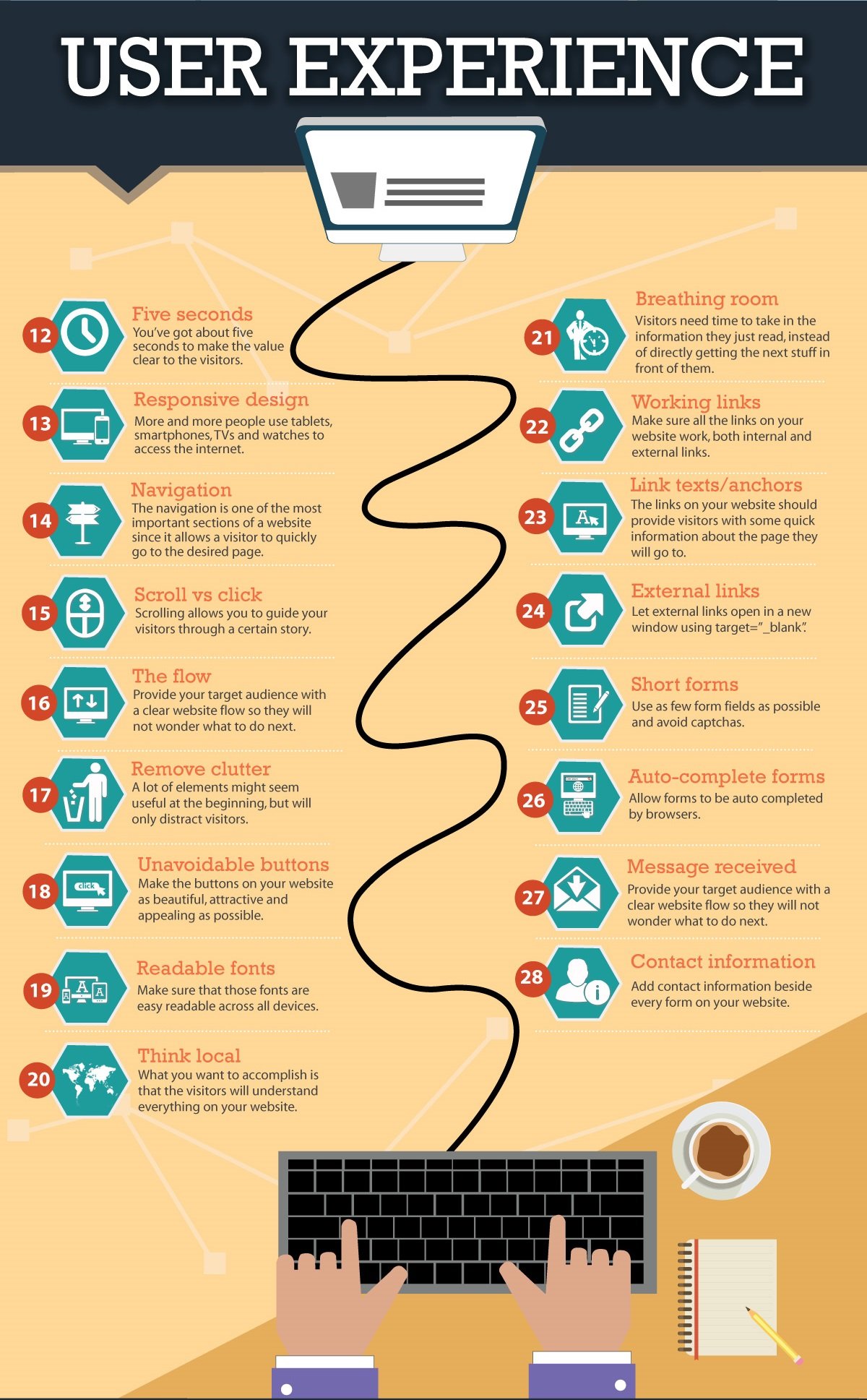
User Experience: The Secret Weapon of Local SEO
Great Local SEO isn't just about keywords and backlinks anymore. Search engines like Google are prioritizing user experience (UX) as a key ranking factor.
Here's why:
A well-designed website with a smooth UX keeps visitors engaged. They spend more time browsing content, clicking internal links, and potentially converting into leads or customers. This positive user behavior sends a strong signal to search engines – your site is relevant and valuable.
Think of it this way: if users bounce off your site immediately because it's slow, confusing, or filled with pop-ups, search engines see this as a sign the site doesn't meet search intent. In turn, your ranking suffers.
By focusing on UX – clear navigation, fast loading times, and mobile-friendliness – you create a website that's enjoyable to use. This happy user experience naturally translates into better SEO performance, propelling your website towards the top of search results.

Review and Revise Your Homepage for Best UX Results
While you may be somewhat limited in what you can do with your existing design, knowing that keeping visitors to your site long enough to become leads or conversions is crucial. Invite third-party critiques of your site with the goal of getting a fresh perspective.
Think about what action you want visitors to take when they land on your homepage and create a prominent “call to action” button, or CTA. The call to action (CTA) on your homepage is an important element to draw visitors further into your site.
You can and probably should have more than one CTA, but it’s also important not to overload your homepage with CTAs. It's best to pick one or two and put your best efforts into those. If you have too many, you’ll create too much visual distraction for users and that can lead to a confusing user experience.
And make sure the "important" stuff is near the top of your page. While there is debate on this still, it is better to err on the side of those who feel that visitors - mobile users especially - are less likely to scroll down the page. And if this is true and your CTAs and phone number, etc. are hidden then you will lose them.
Help With Your Website UX - And Local SEO Strategy
If you are considering getting help with your company's marketing efforts, it is helpful to have the insights of a third-party, a marketing professional, to assess and assist with your strategy. BroadVision Marketing offers helpful information on how to create local SEO strategy.
You can get free advice which will help you learn more about local SEO and its place in Inbound Marketing by visiting our website. You can also call BroadVision Marketing at 707-799-1238.
Still not sure if Inbound Marketing can work for you? Click on the button below and learn more about our suite of digital marketing services.
You May Also Like
These Related Stories

Bring Them Home With Local SEO [Infographic]
Good Local SEO Needs Good Content Marketing

.png?width=302&height=75&name=BVM%20Logo%20-%20transparent%20(1).png)



No Comments Yet
Let us know what you think