A Call To Action For Your Content Marketing
By Jaco Grobbelaar on Wed, Dec 09, 2015 @ 12:30 PM

 Your Prospects Need a Call to Action
What is a call-to-action, CTA, exactly?
On a website, or Internet ad It is typically a virtual button or link that is placed there that will take prospective customers to either a form to be filled out or a landing page. Once they have completed this action, the prospect becomes a lead.
A CTA is the link between the website content that your potential customer was drawn to, your blog post perhaps, and a landing page. The landing page will have a relevant and valuable offer for your prospects which will lead them to complete a short form, maybe something as simple as a first name and email address. It is also one of the elements of an effective inbound marketing strategy.
While your offer in the CTA can be any number of things that a visitor may want to access, there are a few typical offerings that can be used. The CTAs that can attract attention from potential leads include:
-
Download a free ebook
-
Make an appointment
-
Get a free consultation
-
Start a free trial
-
Register for a free webinar
Call-to-action Best Practices
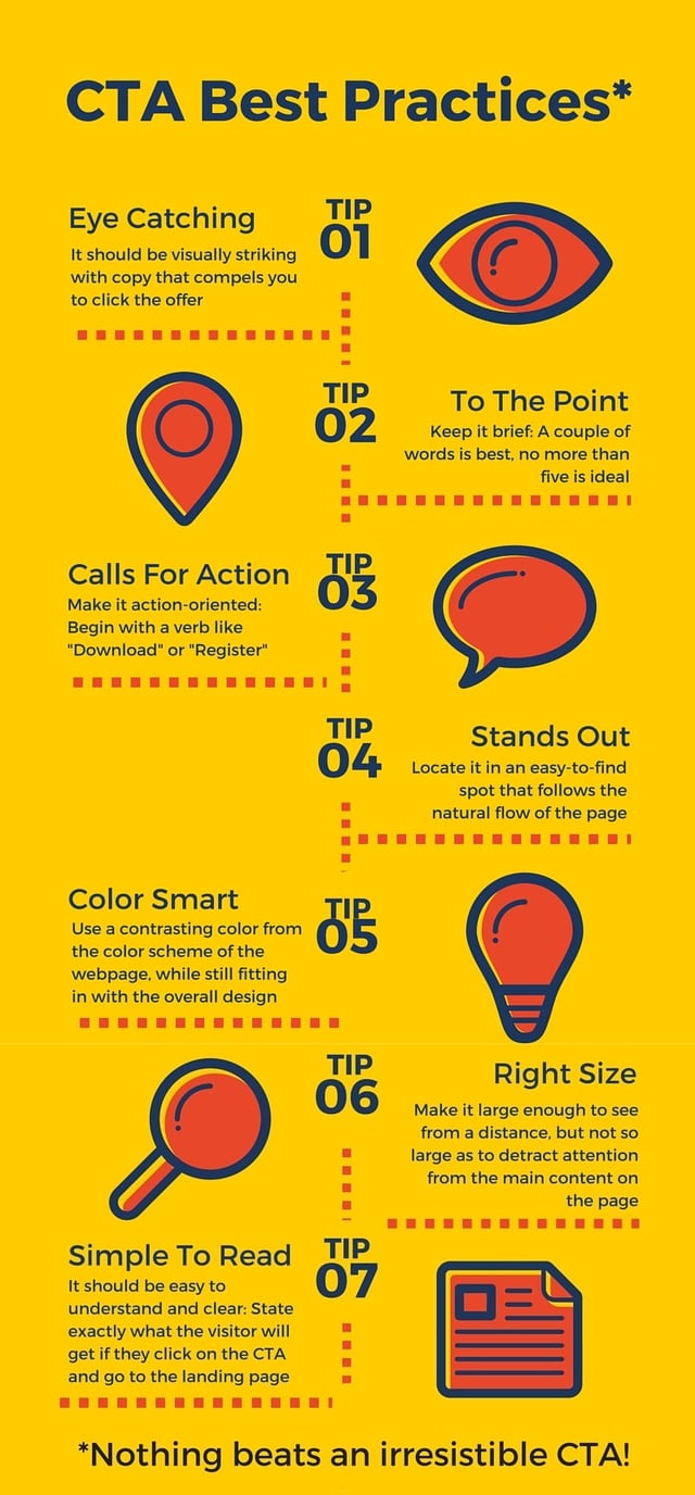
Hubspot recommends that CTAs follow suggested guidelines for optimal results. They state that CTAs should be:
- Visually striking with copy that compels you to click the offer
- Brief: A couple of words is best, no more than five is ideal
- Action-oriented: Begin with a verb like "Download" or "Register"
- Located in an easy-to-find spot that follows organically from the flow of the webpage
- In a contrasting color from the color scheme of the webpage, while still fitting in with the overall design
- Large enough to see from a distance, but not so large as to detract attention from the main content on the page
- Easy to understand and clear: Be sure to state exactly what the visitor will get if they click on the CTA and go to the landing page
In addition, you may want to place your CTA button, or link, in a number of locations throughout your website where it does not interfere with the content. At the end of each blog post is a great spot, for example.

5 Ways to Use a Call-to-action
Capturing an email address or inviting a purchase are not the only reasons for a well-crafted call-to-action. A CTA can be used in a variety of situations. Here are some of them:
1. Attract visitors and turn them into leads. There is very little gained by having visitors stop by your website, look at your home page or your blog post, and then move on, possibly never to return. Capturingtheir attention with a compelling offer in a CTA will allow you to obtain their name and email address at minimum.
2. Nuture leads with additional offers. Ultimately you want leads to become customers so you must find ways to encourage them to buy your product. One way to do this is with a CTA that is placed in spots where leads tend to visit consistently.
3. Create awareness for an event. A bold CTA can draw visitors to events such as webinars or shows that your company is participating in. The link can be used to take a visitor to a registration page that also provides relevant information about the event.
4. Use popular social sharing buttons. These are an easy way for visitors to become engaged with your company by giving them a tool to share your site, your blog posts, and follow you on social media platforms your company makes use of.
5. Encourage a potential customer to make a purchase. For some businesses, a product or service can be purchased right from your website or a landing page. When that is the case, a well-crafted and strategically place Call-to-action is absolutely vital.
A Call-to-action for Your Prospective Customers
Attracting visitors to your website is only the beginning of an effective inbound marketing approach. People have come to your site, read your blog, and studied your company's offerings because you have promised to solve their problem or answer their question.
Once they are have arrived, you have often very little time to spur them to take an action before moving on. Make the best use of that opportunity with great CTAs and compelling and relevant offerings.
Want some help with your marketing efforts? Get your Free Complimentary Inbound Marketing Session to help you make an informed decision or call BroadVision Marketing at 707-799-1238.

 Jaco Grobbelaar is the owner and CMO of BroadVision Marketing. BroadVision Marketing works with business owners to put in place inbound and outbound marketing strategies that consistently secure new clients. The BroadVision Marketing Training Center is located in Petaluma, CA and primarily serves companies in the San Francisco Bay area.
Jaco can be reached at jaco@broadvisionmarketing.com or 707.766.9778 or connect with Jaco on Facebook -www.facebook.com/broadvisionmarketing - and LinkedIn -www.linkedin.com/in/JacoGrobbelaar.
You May Also Like
These Related Stories

Focusing on Who: Three Target Audiences for Your Business Blog

A Call-To-Action For Your Inbound Marketing

No Comments Yet
Let us know what you think