Your Website's Homepage Is A Landing Page. Sort Of.
By Jon Sooy on Wed, Apr 03, 2019 @ 01:27 PM

For business owners or managers, marketing terms can be confusing. But knowing the distinction between a website's homepage and a landing page is critical.

For most businesses it would seem that the ultimate goal when being found on a Google search, for example, is to get a visitor to your website. And, for most, that means bringing them to the homepage. And, for many organizations, this can be sufficient.
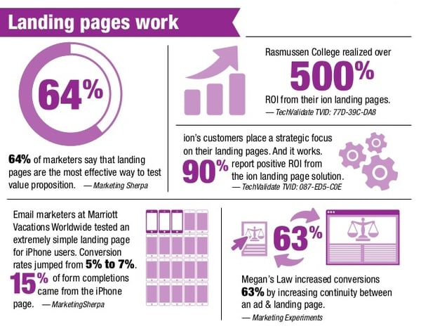
But those clicks don't convert into leads nearly as much as those going to a "post-click" landing page.
Build It and They Will Come - Hopefully
Time for a quick reality check: there are no guarantees in marketing. Okay - maybe one - it's guaranteed that you can spend gob loads of time and money and never know what your ROI is on it all.
But that doesn't have to be the case. In fact, the overriding goal of effective marketing (e.g. inbound marketing) is to optimize your efforts and spending so that you spend less, gain more, and can track everything accurately!
So, armed with a killer inbound marketing strategy, you can rest assured that your efforts will pay off and you can know what's working, what's not, and how to improve.
Which brings us back to this homepage vs post-click landing page thing.
So, what is a "post-click landing page." Well, it is designated as such to distinguish it from the more generic use of the term "landing page" that typically refers to a website's homepage. Here is a very good definition from Instapage:
"A post-click landing page is a standalone web page, disconnected from a website’s navigation, created for the sole purpose of convincing a visitor to act (to sign up, buy, download, etc.)."
Other marketers use the term, as well, although many brands still refer to these specific types of pages with the more broad term of landing page. Okay, so, whatever. A rose by any other name, right? Yeah, except that it just adds to the confusion that is rampant in marketing in general.
So, for our purposes here, we will refer to these puppies "post-click landing pages" because they are NOT your homepage. And they serve a very specific and critical purpose.
Right. So, let's look at that.
A Tale of Two Pages
There are other differing factors, but the biggest one is intent. By that, we mean "Who is this page for?" and "What is it's purpose?" And the answer to these questions are different for these two types of web pages.
Let's start with your homepage:
Ideally, it is written for your preferred audience, your target market, your "avatar", if you use that term. And it is written to inform your visitors as to who you are, what you do for them, and what they can find on your website. Pretty much that, in a nutshell, really.
And there is nothing wrong with this. It needs to exist and it needs to be at the "doorway" or portal to your website. But for marketing purposes - specifically, capturing leads - it's usually not designed for that. Visitors can come and go, explore, poke around, read some stuff, get some good information and you may never know who they were or how to contact them again.
Enter, the post-click landing page.
[Disclosure: Okay, we're going to cave a bit to accepted practices and simply refer to this as a "landing page" from here on out. You get the idea about "post-click" by now, right?]
First, it is only fair to say here that landing pages do come in a variety of styles depending largely on the desired objective. But for our purposes in this post we want to highlight the basics and how they differ from what you see on a good homepage.
- An appealing headline
- A compelling call-to-action
- No navigation
- Concise and relevant value statements
- An image that is also relevant
- And a lead capture form

[graphic courtesy ioninteractive.com]
We won't go into detail on the "how and why" of these elements. We did a great job of that in our last post. The point here is that these are the distinctive components that make a landing page different, both in construction and intent, from your homepage.
Strictly speaking, your landing page serves one purpose and one purpose only: to capture leads. The lack of navigation prevents a visitor who has click onto this page to go anywhere else in your website. For the moment that's what you want - to keep them there on your beautiful landing page with only two actions available to them: respond to your irresistible call-to-action, or exit.
And that's where your relevant and enticing image and copy comes into play. Without overwhelming them, use your image and your words to persuade them to fill out the (brief!) lead capture form and access the wonderful free thing you're offering them.
And that's it!
If you succeed with that then you have achieved the intent, or purpose, of your landing page. Now you have the contact information and permission you need to romance them further.
Why Your Homepage Sucks as a Landing Page
Your homepage is probably wonderful for what it is intended to do although every website needs to be reviewed and improved periodically. But, as a landing page, it sucks. While you have call-to-actions there, it needs to be acknowledged that these can get overlooked easily on a homepage.
All the necessary navigation allows visitors to wander around through any number of pages without ever leaving their name and address for you to use later. And, while you may have a form there or some other ways to capture that information, it's a challenge to use your limited homepage real estate for that purpose.
And, if you think about it, when most of us click on a search result in, say, Google, and land on a homepage, we usually just want some information or determine if this is even someplace we wanted to be. But with a "post-click" landing page (Okay, we said it again...) we purposely clicked on a link because we wanted to get something for free. In other words, after we clicked we expected to end up somewhere so we could access our free goodies.
And a good landing page makes that a sure thing! Most of the time, anyway.
Talk to Us About Landing Pages and Inbound Marketing
If you are considering getting help with your company's inbound marketing efforts, it is helpful to have the insights of a third-party, a marketing professional, to assess and assist with your strategy.
BroadVision Marketing offers helpful information on how to use LinkedIn. You can get free advice during your Free Complimentary Inbound Marketing Session which will help you learn more about landing pages and their place in Inbound Marketing.
You can also call BroadVision Marketing at 707-799-1238.
Still not sure if Inbound Marketing can work for you? Click on the button below and download our free Inbound Marketing data charts. The proof is in the numbers!
You May Also Like
These Related Stories

Seven Deadly Sins Of Your Website Design

Seven Deadly Sins Of Your Website Design

.png?width=302&height=75&name=BVM%20Logo%20-%20transparent%20(1).png)


No Comments Yet
Let us know what you think